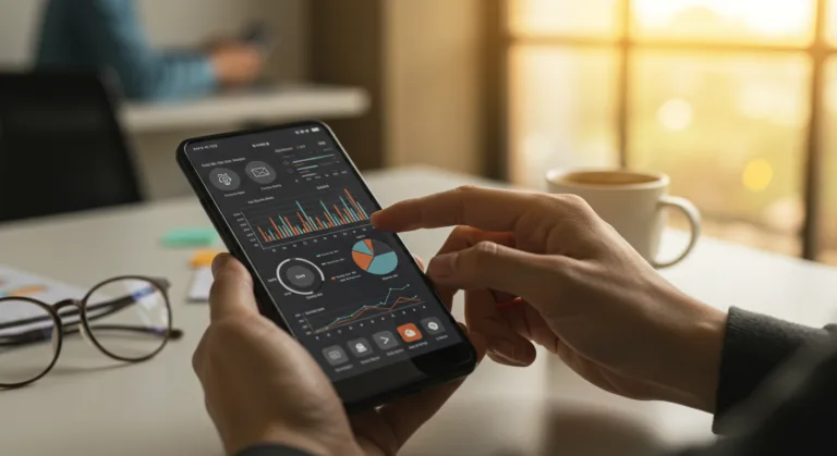
In 2026, a new wave of digital threats nearly sank Sarah Chen’s company, Horizon Health Innovations. Her firm, a fast-growing name in personalized telemedicine, had built its entire business on a sleek mobile app that connected patients to specialists, managed prescriptions, and stored sensitive health data. When a phishing campaign hit Horizon’s users, attackers exploited subtle UI inconsistencies and a clunky authentication flow, proving that even their strong backend security had a weak spot at the user interface. The attack caused a 20% drop in active daily users over two weeks and a serious loss of trust, revealing a critical truth: mobile UI/UX for cyber resilience is a foundational pillar. How could a well-funded, security-conscious company miss such a glaring point of failure?
Key Takeaways
- Make multi-factor authentication (MFA) with biometrics the default for all accounts. According to Microsoft’s 2023 Digital Defense Report, this alone can reduce credential compromise by up to 99.9%.
- Write clear, actionable error messages and security prompts in plain language, avoiding the technical jargon that just confuses users into making insecure choices.
- Run quarterly user experience (UX) audits that are specifically looking for phishing vectors and social engineering vulnerabilities hiding in your mobile interface.
- Use visual cues like color-coded security indicators and totally consistent branding across authentication screens so users can instantly spot legitimate requests from malicious fakes.
The Horizon Health Breach: A Case Study in UI/UX Vulnerability
Horizon Health Innovations took pride in their strong encryption protocols and dedicated cybersecurity team, running weekly penetration tests on their backend infrastructure hosted on Google Cloud Platform’s secure regions. The attack, however, wasn’t a direct hit on their servers. It started with convincing fake emails sent to Horizon’s users about “account verification,” which contained links to spoofed login pages. The real problem was how similar these fake pages looked to Horizon’s actual mobile login screen, which was already frustrating users with a slightly awkward, multi-step authentication process. Accustomed to minor UI glitches in all sorts of apps, users didn’t flag the subtle differences in the phishing site’s layout or its slightly off-brand font. For example, the real Horizon app sometimes took a painful 10-15 seconds to load the biometric prompt after password entry, a delay the attackers weaponized by creating a fake prompt that appeared instantly, making their fake feel more responsive.
“We had invested heavily in network security and data encryption,” Sarah told me during our post-incident review. “But we completely overlooked the human element, how our users interact with our app, especially when they’re distracted.” This oversight is common. A 2025 report by the Ponemon Institute on the Cost of a Data Breach found human error and system glitches were behind nearly half of all breaches, and poor interface design just makes it easier for people to make mistakes or get tricked. The attackers didn’t hack Horizon. They tricked Horizon’s users through a poorly designed front door.
Principle 1: Clarity and Consistency in Authentication Flows
Your first line of defense is an authentication process that’s dead simple and always looks the same. Horizon’s original app forced users to enter a password, wait for a push notification, and then type a six-digit code. While technically secure, this clunky process created friction and visual changes that felt jarring. The push notification might appear instantly or it might be delayed, creating inconsistency. The phishing sites mimicked a much simpler, single-step login, which paradoxically felt more efficient to users and made the legitimate, more complex flow seem broken by comparison.
After the breach, Horizon Health completely revamped its authentication. They now use a unified sign-on screen that clearly shows all options at once: password, biometric (Face ID or Touch ID), and a QR code scan for linking a new device. “We made biometrics the default and the most prominent option,” Sarah explained. “It’s faster, more secure, and way less phishable.” This move aligns with recommendations from the FIDO Alliance, whose 2024 guidelines push for user-friendly biometrics to get people away from passwords. Now, every single authentication screen uses an identical color palette, font, and logo placement, plus a unique, dynamic security seal that subtly changes with every valid session, helping users instantly spot a legitimate prompt.
Principle 2: Intuitive Error Handling and Security Prompts
One of the most devious parts of the Horizon Health attack was how the fake sites handled login errors. If a user mistyped their credentials on the phishing page, it just showed a generic “Login Failed, please try again.” The real Horizon app, however, had more technical error messages, sometimes mentioning network issues or server load. That small difference made the phishing site’s error handling feel more direct. When the real app threw an error like “Connection to authentication server timed out. Please check your network and try again,” users felt frustrated and less secure, making them more open to a simpler (and malicious) alternative.
For real cyber resilience, error messages must be clear, actionable, and never induce panic or confusion. After the breach, Horizon Health redesigned all its security-related messages. Now, a failed login gets you, “Incorrect username or password. Please verify your input.” If the system spots weird activity, it says, “Unusual login attempt detected. For your security, we’ve sent a verification code to your registered email/phone.” Importantly, it also provides a direct, in-app link to their security support page, not an email address that could itself be spoofed. This kind of proactive guidance helps users without overwhelming them, turning a potential moment of panic into a teaching opportunity that reinforces secure practices.
Principle 3: Visual Cues for Trust and Security Indicators
Humans are highly visual creatures, processing images far faster than text. This cognitive reality means visual cues are everything for building user trust and signaling security status. Horizon’s original app had a tiny, static padlock icon in the corner of its login screen, a standard but easily ignored element that the phishers just copied, making it useless as a trust signal.
The redesigned Horizon app uses dynamic, context-aware visual security indicators. During a secure session, a prominent, animated green shield icon sits in the top navigation bar. If the app detects anything strange, like a session timeout or a change in network, this shield turns amber and a small banner appears stating, “Session security reduced. Please re-authenticate.” When you do something sensitive, like viewing medical records, a temporary full-screen overlay confirms “Action requires elevated security. Biometric verification requested.” This constant visual reinforcement trains users to recognize what a secure state looks like and to question anything that deviates. It creates a visual language of security that users instinctively understand, like a traffic light. This is exactly the kind of clear visual feedback the National Institute of Standards and Technology (NIST) advocates for in user interfaces to improve security awareness.
Principle 4: Minimizing Cognitive Load and Reducing Decision Fatigue
Cybersecurity often requires users to make critical decisions, usually when they’re busy or distracted. A complex UI, filled with too many options or unclear pathways, just makes a bad situation worse. Horizon’s initial app buried its “Security Settings” menu three layers deep, with baffling options like “Manage API Keys” and “Session Management” that nobody understood. This complexity meant users rarely touched these features, leaving default settings in place that weren’t always ideal for their security.
The principle is simplification. Horizon Health collapsed everything into a single, easy-to-find “Security & Privacy Dashboard” on the main menu. Options are now in plain language: “Two-Factor Authentication (On/Off),” “Connected Devices (Review & Remove),” and “Data Sharing Preferences.” Each option includes a brief explanation of its purpose, like the one under Two-Factor Authentication that reads: “Adds an extra layer of security to your account, making it much harder for unauthorized users to access.” This simplification helps users understand and actually use security features. It’s about making security effortlessly accessible. Expecting users to navigate complex jargon is a design failure, not a user failing.
“In a blog post, cybersecurity firm Censys, which scans the internet for exposed or vulnerable systems, said that it identified more than 800 distinct deployments of Artex that were accessible from the web without needing a password to log in.”
Principle 5: Proactive User Education Through UI/UX
Finally, the mobile UI/UX itself can be a powerful tool for user education. Horizon Health used to send out security tips in email newsletters and push notifications that most people ignored. After the breach, they started building educational moments directly into the app experience.
For example, the first time a user enables two-factor authentication, a short, interactive tutorial pops up to show how the push notification works and what a real one looks like. If a user tries to log in from a new device, a prompt appears that not only asks for verification but also explains why: “Logging in from a new device? We’re just confirming it’s you to protect your health data.” This contextual education is far more effective than generic security bulletins because it teaches users in the moment, when the information is most relevant. The app becomes an active partner in user security. As Sarah Chen noted, “Our support tickets related to phishing attempts dropped by 70% in the six months following these UI/UX changes. Users started reporting suspicious emails to us, rather than falling for them.”
Resolution and Lessons Learned
Horizon Health Innovations emerged from its crisis stronger, with a new and vital focus on its user-facing security. The company invested in a dedicated UI/UX security audit team, which ought to be standard practice for any organization that handles sensitive data. Their recovery involved fundamentally rethinking how their mobile application communicated security to its users. The incident was a painful reminder that even the most advanced backend security is only as strong as its weakest link, which is almost always the user’s interaction with the interface.
Clear, consistent, and intuitive design builds a resilient defense against evolving cyber threats. For deeper insights, you can see how TrueSpatial UI abandonment highlights similar user experience challenges. Also, read about app security defenses against botnets for a broader perspective on mobile protection.
What is mobile UI/UX for cyber resilience?
It’s the practice of designing user interfaces and experiences that actively protect users from cyber threats. This means making secure actions intuitive, making risks clear and easy to spot, and reducing the chances of someone making a mistake or falling for a social engineering trick.
How can consistent branding improve mobile app security?
Consistent branding helps users instantly distinguish legitimate app interactions from phishing attempts. When your logos, color schemes, and fonts are always the same on authentication and security screens, any deviation in a malicious overlay or fake site becomes a glaring red flag.
Why are clear error messages important for security?
They prevent the user confusion and frustration that often lead to insecure behavior. A well-designed error message guides a user on how to fix a problem securely, reinforces their trust in the app, and stops them from looking for a simpler (but malicious) alternative.
What role do visual cues play in mobile security?
Visual cues provide immediate, at-a-glance feedback about a user’s security status. Things like dynamic security icons that change color or temporary overlays for sensitive actions help users instinctively recognize what a secure environment looks like and immediately identify potential threats.
How can mobile UI/UX reduce cognitive load in security?
It reduces cognitive load by simplifying security settings, using plain language instead of technical jargon, and presenting options clearly. When users can actually understand and configure security features without being overwhelmed, they’re far more likely to use them, which improves their overall security.