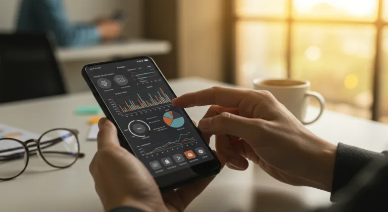
With so many interconnected systems and specialized AI models out there, organizations are relying more and more on multiagent dashboards to keep an eye on their operations in real time. For these mobile dashboards, good UI/UX is the difference between an operator acting on an insight and that same insight getting lost in the noise. The real question is how to design mobile interfaces that actually help people making decisions in these chaotic, multi-agent environments.
Key Takeaways
- Build a hierarchical information architecture for your mobile multiagent dashboards, forcing the most critical alerts to the top so they get seen immediately.
- Design for glanceability. Your users should be able to read an agent’s state in 3-5 seconds, which you can achieve with high-contrast visual cues and very concise data visualizations.
- Put context-aware filtering and search capabilities right in the mobile UI, because users need to be able to find a specific agent group or data stream without endless scrolling.
- Your dashboard needs bi-directional interaction models that let users issue commands directly to agents from their phone, instead of just passively watching what’s happening.
- Run scenario-based user testing with your actual operational teams, simulating high-stress and data-heavy situations to see if the mobile UI/UX really holds up.
| Factor | Desktop Dashboard | Mobile Multiagent Dashboard |
|---|---|---|
| Information Display | Multiple large panels, intricate graphs, extensive tables | Ruthless prioritization, intuitive pathways to deeper info |
| Primary Use Cases | Complete monitoring, detailed analysis | Monitoring exceptions, critical alerts, high-level directives |
| Cognitive Load | Higher tolerance for complexity | Requires minimal interaction friction |
| Alert Processing | Potentially buried in extensive data | Critical alerts prioritized at top level |
| Glanceability | Less emphasis on immediate interpretation | Interpret agent states within 3-5 seconds |
| Interaction Model | Extensive input options | Bi-directional, direct command issuance from UI |
Designing for Cognitive Load in Dynamic Environments
The biggest headache with mobile multiagent dashboards is managing cognitive load. On a desktop, you have the screen real estate for multiple panels, complex graphs, and huge data tables, but a mobile screen forces you to be ruthless about what you show. Your design thinking has to move from ‘display everything’ to ‘display the right thing at the right time’ with as little friction as possible. People using the mobile version are typically monitoring for exceptions, getting critical alerts, and firing off quick, high-level directives.
Think about a logistics company managing a fleet of autonomous delivery vehicles. A dispatcher sitting at their desk gets a giant map, telemetry for every vehicle, route optimization data, and predictive maintenance schedules all at once. Trying to cram that onto a phone is a recipe for disaster. The mobile UI has to be smarter, surfacing only the most pressing events: a truck that’s gone off-route, a specific unit whose battery life is plummeting, or a holdup at a delivery hub. The user needs to be able to tap that alert, see the specific agent’s status, and maybe even tell it to reroute or run a diagnostic, all in a few taps. You can’t design that without deeply understanding the operational workflow and what information is a “deal with it now” problem versus something that can wait for a bigger screen.
Intuitive Information Hierarchy and Visualization
A solid information hierarchy is non-negotiable for these mobile dashboards. I’m a fan of a layered approach. The top layer gives you a bird’s-eye view of system health and only the most important alerts. This might mean showing a summary of agent groups (like, “Fleet 1: 2 critical, 5 warnings,” or “Robotics Bay A: All clear”) instead of a massive list of individual agents. Simple visual cues like color-coded status badges, red for critical, yellow for warning, green for normal, give instant context without forcing someone to read text, which is something a Nielsen Norman Group study on mobile usability confirms people are much slower at on small screens.
When you’re designing data visualizations for mobile, simple and clear wins every time. Don’t try to cram complex charts with a dozen data points onto a phone. You’re better off with single-metric displays, sparklines to show a quick trend, and unambiguous status indicators. For instance, instead of a spaghetti graph of CPU usage for 20 agents, the mobile dashboard could show one bar for the cluster’s average CPU usage and only flag an alert if an individual agent spikes. If a user really needs to see the detailed graph for that one agent, they can get to it through a drill-down view. Think about the clarity and intentionality in Material Design’s components. Those same ideas apply perfectly to showing complex data on a phone.
And don’t forget gestural controls. Swiping between agent groups, pinching to zoom on a specific part of a simplified chart, or long-pressing an agent’s icon to pop up a quick action menu can make the whole experience feel more fluid. This isn’t about making it look cool. It’s about reducing the physical and mental work needed to get something useful out of the dashboard.
““I spend about maybe $100[,000] to $200,000 a year on tokens,” he told Isaacson. He uses agents for countless work projects and coding tasks and has freely shared his set of 23 Claude Code skills, called gstack, on GitHub, an effort to help teach others what agents can do, he said.”
Context-Aware Interaction and Actionability
A good mobile multiagent dashboard is for more than just watching. It has to be about actionability. Your users have to be able to interact with the agents and issue commands right from their device, which means you need to design input methods that work well on a touchscreen. Dropdown menus for common commands, simple toggles, and text fields with predictive or pre-defined options work much better than asking someone to type into a command line on a phone keyboard.
Context-aware interaction is where next-gen mobile UI/UX really gets interesting. Let’s say a user is looking at an alert for an agent with a performance anomaly. A smart dashboard should suggest relevant actions based on that specific context. If an agent is reporting a network problem, the dashboard could offer up “Restart Network Module” or “Run Diagnostics” as one-tap buttons, saving the user from digging through menus. This kind of proactive design cuts down on resolution time and user error, a finding backed up by a 2020 ACM study on intelligent user interfaces that showed major efficiency gains from context-sensitive suggestions.
You also have to think about offline capability. Real-time data is great, but mobile networks aren’t always reliable. A well-designed dashboard will cache important information and let users queue up actions that can be sent later. This might mean showing the agents’ last known good state and letting an operator write up a command that gets executed as soon as the phone has a signal again. It’s just a practical acknowledgment of how mobile networks actually work in the field.
Feedback Mechanisms and User Testing
You can’t build a successful mobile UI for these systems without solid feedback mechanisms. When an operator issues a command, they need to know what happened. This means immediate confirmation (like a toast notification) that the command was received, and then subsequent feedback on its execution status, maybe by changing the agent’s icon or adding an entry to a command log. If an operator isn’t sure their command went through, it causes frustration and, worse, operational mistakes. Think about how your smart home app confirms a light is off. You need that same level of obvious, instant feedback.
On top of that, rigorous user testing is absolutely non-negotiable. And the point of this testing is to validate the design under real-world pressure, not just to see if the app crashes. We recommend running scenario-based tests with your actual users. Put an operator in a room, give them the mobile dashboard, and simulate a critical agent failure while someone is asking them for an update on something else. That’s how you find the real usability flaws that never show up in a quiet lab. Make sure you test with a mix of users, some with deep technical skills, some without, to see how the design holds up across different roles. The feedback you get from these tests is gold for refining the mobile experience.
Security Considerations and Authentication
Since you’re giving users remote control over complex systems, security has to be baked in from the ground up. This means strong authentication mechanisms, not just a password. Multi-factor authentication (MFA) using the phone’s biometrics (fingerprint or face ID) or a hardware token should be the default. The UI needs to make this authentication process as quick as possible without cutting corners, probably by just tapping into the phone’s built-in biometric APIs.
Also, role-based access control (RBAC) needs to be visually obvious within the dashboard. A user must immediately understand what they can and can’t do. This is how you stop people from accidentally doing things they aren’t supposed to and keep your data clean. For example, a supervisor might see the button to re-route an entire fleet of vehicles, while a field technician looking at the same dashboard doesn’t even know that button exists. This level of granular control and clear visual cues is what maintains operational security and compliance, especially if you’re working in a regulated industry. It’s part of the same challenge as securing mobile private AI.
So, building a great UI/UX for these mobile dashboards comes down to obsessing over cognitive load, making interactions feel natural, and providing strong feedback. If you prioritize the right information, simplify your charts, and build in context-aware actions, you’ll actually help users manage these complex systems from anywhere. This is only going to get more important as mobile AI models gain accuracy. And of course, the increasing use of AI brings its own set of challenges for AI apps and privacy that product managers have to figure out.
What is a multiagent dashboard?
It’s a single interface for keeping tabs on and controlling a bunch of autonomous or semi-autonomous systems, like software agents or robots. You use it to see what they’re all doing, individually and as a group, in real time.
Why is mobile UI/UX critical for multiagent dashboards?
Because operators and managers aren’t always at their desks. Good mobile UI/UX lets them monitor and control these complex systems from anywhere, so they can react to problems immediately and keep operations running without being tied to a workstation.
How can cognitive load be reduced in mobile multiagent dashboards?
You reduce cognitive load with a smart information hierarchy that bubbles up critical alerts, by using simple and easy-to-read data visualizations, and by building in smart filters and context-aware action suggestions so the user doesn’t have to hunt for things.
What kind of feedback is essential for mobile multiagent interactions?
The user needs immediate confirmation that a command was received, a clear visual update on the status of that command’s execution, and notifications for any important changes in an agent’s state. Basically, they need to know the system heard them and is acting on their instructions.
What security features should mobile multiagent dashboards include?
At a minimum, they need strong multi-factor authentication (MFA), role-based access control (RBAC) that is clearly reflected in the UI (e.g., hiding buttons a user can’t use), and secure data transmission to protect the system from unauthorized access and control.