Running a produced water treatment plant is a complex dance of precision and timing, and operators need data they can act on right now. Good mobile UI/UX design is about getting them that data, moving their tools from clunky, static dashboards to interactive apps that actually help them make decisions out on the plant floor. This isn’t about slapping a pretty face on a SCADA screen. We’re engineering an experience that has a direct line to operational efficiency, plant safety, and staying on the right side of tough environmental regulations. So how do we build mobile interfaces that people in the field will actually use and rely on?
Key Takeaways
- Build with a mobile-first design approach. Don’t try to shrink a desktop screen. Focus only on the core functions and data an operator needs at a glance.
- Use real-time data visualization with tools like Grafana or custom D3.js charts so operators can see what’s happening instantly instead of deciphering raw numbers.
- You must have solid offline capabilities. Plants in remote locations with spotty connections need apps that can log data and manage alerts without a live network.
- Get out of the office and do regular user testing with plant operators. You have to validate your design ideas with the people who will use them in their real work environment.
- Follow established industrial usability standards like ISA-101 to make sure your alarm management and process controls are effective and don’t create confusion.
1. Define Core User Personas and Their Critical Tasks
You can’t start designing until you know exactly who you’re designing for. In a produced water treatment plant, that means process operators, maintenance technicians, and maybe a supervisor. Each one has a completely different job to do. A process operator is staring at flow rates, pressure readings, and chemical dosing for units like a dissolved air flotation (DAF) system or a biological reactor. The maintenance tech couldn’t care less about that. They need to see equipment health, get predictive maintenance alerts, and pull up digital work orders. I’ve seen projects get bogged down in feature bloat because the team tried to build one single app for everybody, which ends up being an app that’s frustrating for everyone.
The only way to get this right is to go on-site and interview the actual staff. Watch their daily routines, ask what info they look for a dozen times a day, and find out what they hate about their current systems (which are often just paper logs or ancient desktop software). You need to document these findings as detailed user personas that include their comfort level with tech, the conditions they work in (like needing to wear gloves or working in low light), and what they’re trying to accomplish. This isn’t just theory. It’s the foundation of an app that won’t get ignored.
Pro Tip: Figure out their “jobs to be done.” Are they trying to spot an anomaly in the filtration system fast, log a chemical delivery before the truck leaves, or just check if a pump is running? This focus is what keeps you from building a monster of an app that does a hundred things poorly.
2. Prioritize Essential Information with a Mobile-First Approach
A phone screen is small, and that limitation is a gift because it forces you to be disciplined. You absolutely cannot just copy your entire desktop SCADA dashboard and shrink it. You have to adopt a mobile-first design strategy. Figure out the non-negotiable, critical data points and controls each person needs. For a process operator, that’s probably a live look at influent and effluent quality (TSS, oil and grease, pH), the status of a few key pumps, and any screaming alarms. Everything else can be a tap or two away, but it doesn’t belong on the main screen.
Build your information in layers. The main dashboard gives a high-level view of plant health, maybe with simple green, yellow, and red status indicators. Tapping a specific unit or alert should then drill down into the details for just that item. Card-based layouts work great for this, as they’re easy to scan. A “DAF Unit Status” card, for instance, could show flow, pressure, and dissolved oxygen, with a quick link to its controls. A 2014 paper from the Human Factors and Ergonomics Society is getting old, but its insights on information density on mobile screens are still spot on for this kind of work.
Common Mistake: Jamming the first screen with tons of data. An operator under pressure will just get overwhelmed and won’t be able to find what they need. If they have to scroll sideways to see everything, you’ve already lost.
3. Design Intuitive Navigation and Interaction Patterns
An operator who isn’t a tech wizard still needs to be able to navigate your app without a second thought. Standard mobile patterns are your friend here, like a bottom navigation bar for the big sections (“Overview,” “Alarms,” “Reports,” “Maintenance”) and a simple hamburger menu for things they won’t use as often. Every single button, slider, or input field has to be big enough to be tapped easily with a thumb, and often, a gloved finger. A target size of at least 44×44 CSS pixels is a good rule of thumb that covers both accessibility standards and the practicalities of industrial work.
When it comes to data input, get rid of the full QWERTY keyboard wherever you can. Use dropdowns, simple toggles, and number pads instead. If someone absolutely must type text, make sure you have auto-completion and very clear labels. You might even consider voice input for some tasks where an operator needs their hands free, but you have to be realistic about how well that will work in a noisy plant environment (it’s usually a struggle).
3.1 Implement Clear Visual Hierarchy and Feedback
Use color, font size, and spacing to draw the operator’s eye to what matters. A critical alarm needs to pop with a distinct color like red and an obvious icon. Every action a user takes must get immediate visual feedback. When they press a button, it should look like it’s being pressed. When they submit data, a confirmation message should appear. This is how you build trust and stop users from wondering if the app is even working. For instance, when an operator acknowledges an alarm, its visual state has to change immediately from a glaring red to maybe an amber color, with a timestamp showing who acknowledged it and when.
Example: On a recent project for a produced water facility, we put a red banner across the top of the screen for any “Critical Alarm.” Tapping that banner expanded the list of active alarms, and each item had a big “Acknowledge” button. After tapping it, the button would briefly show “Acknowledging…” and then switch to “Acknowledged” as the alarm’s background color changed to amber. This tiny bit of feedback made a huge difference in how confident the operators felt using the system.
4. Integrate Real-time Data Visualization
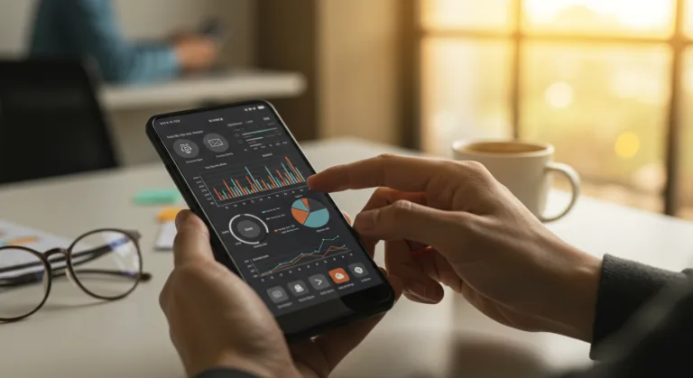
A list of raw numbers is hard to process when you’re in a hurry. Visuals are what make data understandable in a split second. For a water treatment plant, that means line charts showing trends like influent turbidity over the last 24 hours, gauges showing a current value against its setpoint like pH level, and bar charts for comparing things like daily chemical use. You can pull in tools like Grafana or build your own charts with libraries like D3.js for a more custom feel. The trick is to show the data in context, presenting the current value right alongside historical trends and the operational limits. A chart showing water flow, for example, is far more useful if it also has lines indicating the minimum and maximum acceptable flow rates.
Make sure your charts are readable on a small screen and don’t get cluttered with too many data series. Let users zoom, pan, and pick time ranges to dig deeper. Giving them the power to compare today’s performance against last week’s average or a regulatory limit is how they spot problems before they become emergencies. A 2024 report from ARC Advisory Group keeps hitting on the need for intuitive HMI design, and these principles apply directly to the mobile apps we’re building for these process industries.
Pro Tip: Use “sparklines,” which are tiny, simple trend graphs you can put on summary cards. They give an operator immediate context on a dozen different parameters at once, letting them scan quickly and see which ones might need a closer look. Quick context. No drill-down needed.
5. Develop Strong Offline Capabilities
Many produced water treatment plants are out in the middle of nowhere, with cell service or Wi-Fi that’s spotty at best. An app that needs a constant internet connection is a paperweight in these places. You have to design the app to store data locally on the device, including things like operator logs, maintenance checklists, equipment manuals, and even some historical trend data. As soon as the device finds a connection again, the app must be smart enough to automatically sync its local changes back to the main system and handle any data conflicts.
Think about an operator who needs to log a pump inspection or record a meter reading when they’re completely off the grid. The app has to let them do their job and just queue the data for upload later. It also needs to show them a clear icon indicating the connection status and tell them when the sync is complete. This means you need a serious local database solution like Area or SQLite built into a solid synchronization framework. This isn’t a “nice-to-have”. It’s a requirement.
Common Mistake: Just assuming the internet will be there. It’s a fatal assumption that leads to lost data, angry users, and an app that gets abandoned. Always, always design for the worst-case connectivity scenario first.
6. Incorporate Alerting and Notification Systems
Good alarm management is everything in an industrial plant. Your mobile app has to deliver timely, relevant notifications for serious events without burying the operator in noise. This is all about filtering alerts based on the user’s role and even their physical location. The person working on the DAF unit doesn’t need an alert about a small problem in the boiler room unless it’s going to affect their process directly.
Use different kinds of notifications (push notifications, in-app banners, sounds) for different levels of urgency, and give users some control over their preferences. The most important feature, though, is the ability to acknowledge and add a comment to an alarm right from the phone. This creates a clear trail of accountability and helps everyone track how an issue is being resolved. Sticking to standards like ISA-101 (Human Machine Interfaces for Process Automation Systems) is the professional way to design alarm systems that help instead of distract. With the Environmental Protection Agency (EPA) constantly watching wastewater discharge, having accurate and timely data driven by good alerts is just part of staying compliant.
7. Conduct Extensive User Testing in the Field
The smartest design you come up with in a quiet office will almost never survive first contact with the reality of a treatment plant. As soon as you have a working prototype, you must get it into the hands of actual plant staff and conduct user testing in their work environment. Watch them use it. See where they get stuck, what they can’t figure out, and listen to their feedback. Can they actually press the buttons while wearing gloves? Is the screen readable in the glare of the sun or in a dimly lit pump house? How fast can they complete a critical task?
This cycle of testing and refining is where the magic happens. I’ve personally watched what I thought were perfect designs fall apart in the field because we didn’t think about screen glare, or the need to use the app with one hand while holding a railing, or what happens when an emergency call interrupts them mid-task. Use tools like UserTesting or just go out there with a clipboard and watch. You fix the problems you find based on how often they happen and how badly they screw things up. This is the only way to make sure the final app is something they’ll actually adopt.
Example: During a field test for a chemical dosing app, we saw operators fumbling to enter decimal values for concentrations while wearing thick safety gloves. Making the buttons bigger wasn’t enough. We ended up building a custom numerical keypad with huge, spaced-out digits and added buttons for common presets, which dramatically cut down on input errors and operator frustration.
Designing mobile UI/UX for a produced water treatment plant is a specific skill that blends knowledge of industrial processes with a deep focus on the user. When we concentrate on what operators actually need, prioritize the data that matters most, build for poor connectivity, and test our work in the real world, we create apps that make the plant run better and safer. These aren’t just digital gadgets. They are necessary tools for modern plant management that help ensure compliance and optimize how resources are used in a tough environment. Thinking about how mobile apps can reshape manufacturing operations gives a broader context. Likewise, paying attention to mobile accessibility is just smart business, preventing users from giving up on your app. And finally, keeping an eye on the bigger mobile ecosystem shifts helps you build solutions that will last.
Why is a mobile-first approach so important for industrial apps?
Mobile-first forces you to be disciplined. Because the screen is so small, you have to cut the noise and focus only on the most essential information and functions. This gives you a much cleaner interface that an operator can use quickly in a high-pressure environment where every second counts for making a decision.
What are the biggest challenges when designing for plant operators?
The challenges are all physical and environmental. You have to make sure the screen is readable in bright sun and low light. You have to design for fingers in thick gloves. You have to account for loud background noise when designing alerts. And you absolutely must build for spotty or non-existent connectivity in remote areas, all while trying to connect to older industrial control systems. It’s all about their real-world conditions.
What’s the best way to show real-time data on a small phone screen?
Use simple, clean visuals. Tiny “sparkline” charts for trends, clear gauges to show a value against its target, and simple color-coding for status (green, yellow, red) work best. The key is giving context. Don’t just show a number. Show it next to its normal operating range or a regulatory limit so an operator can tell if it’s good or bad in a single glance.
What specific offline features does an app for a water treatment plant need?
At a minimum, the app has to locally store any logs, checklists, manuals, and recent data trends an operator might need. It must let them enter new data, like inspection notes or meter readings, while they’re completely disconnected. Then, it needs to be smart enough to automatically sync all of that back to the central server without losing anything once a network is available.
How big of a deal is user testing for these kinds of industrial apps?
It’s everything. Doing user testing in the actual plant is the only way to find out if your design works in the real world. It’s where you discover that the glare makes your color scheme unreadable or the buttons are too small for gloved hands. It closes the gap between your ideas and the operator’s reality, and it’s what in the end gets people to trust and use the tool you’ve built.